

Grow Your Garden
The goal of the gardening app is to provide users with a starting point in designing their garden. Through this app, users have the opportunity to see how their garden will look like with the plants they choose. They have a variety of options available to them, and the plants are categorized into flowers, herbs, vegetables and fruits. The app then allows users flexibility in their garden so they can create the best garden possible.
Sketching & Ideation
The goal of the gardening app is to provide users with a starting point in designing for their garden. Through this app, users have the opportunity to see how their garden will look like with the plants they choose. They have a variety of options available to them, and the plants are categorized into flowers, herbs, vegetables and fruits.


Creative Strategy

The goal of the gardening app is to provide users with a starting point in designing for their garden. Through this app, users have the opportunity to see how their garden will look like with the plants they choose. They have a variety of options available to them, and the plants are categorized into flowers, herbs, vegetables and fruits.
Final Look


Video Demonstration

Improving the
Usability of
Elections
Canada
My Roles:
Duration:
Tools
Sole User Research & Design
4 Weeks
Figma
Canva
Miro
My Project:
My project focuses on improving the usability of the Elections Canada website. As citizens, we want access to accurate information in order to make informed decisions. The websites that provide this valuable content should be accessible, readable, updated frequently, and have a good information hierarchy. Through conducting usability testing and card sorting, I uncovered insights that informed my design decisions in redesigning pages on the Elections Canada website.
My project was developed with a micro-grant provided by GLOCAL through the CANConnect Micro-grants program.
Who is Elections Canada?
Elections Canada “is an independent, non-partisan agency of Parliament. Its primary task is to be prepared at all times to administer an electoral event” (Elections Canada, 2024).
The Elections Canada website contains various resources and information on topics such as voting, electoral districts, voting registration, results from past elections, Members of Parliament, and political entities.
Purpose
The purpose of this study is to evaluate the current Elections Canada website through usability testing. The findings from this testing will help in suggesting improvements to make the website more accessible, functional, user-friendly and ultimately more engaging for voters. To achieve these goals, we need to look at how the website currently operates, how information is displayed on different pages, the information architecture, and the aesthetics of the website.
Scope
In this study, I aim to improve the overall usability of the Elections Canada website, and to make the experience more user friendly for voters. Through usability testing, the areas that can be improved will be highlighted by participants. The specific areas that will be the focus of this study will be the “Voters” section of the website and the landing page.
Users participating in usability testing were all Canadians and included a mix of those who had voted in the past federal and provincial elections and those who had never voted before. Therefore, most tasks facilitated during the usability testing were designed with the idea to explore the different tools and resources available on the website and to engage with the information on the website.
Design Process

Goals
Ease of website navigation will improve the website immensely because it will allow the information to be located by users with more ease and efficiency. Having a strong website navigation contributes to a better user flow and prevents users from taking a trial-and-error approach.
Improving how information is displayed will be very beneficial for Elections Canada because it is a very information heavy website that can overwhelm users. Visualizing information in a more condensed, clear and easy to scan way can greatly improve the functionality of the website.
Promoting consistency will make the functionality of the website much better. Being able to follow standardized and universally accepted processes for certain functions and features on websites, such as buttons, text size, and readability, is almost non-negotiable and expected by users. Improving the consistency will make the user experience more effortless.
Engaging voters with information about elections will be easily achieved by making improvements to the overall website. The current website contains a lot of valuable information that can be hard to find or is not as accessible as it should be. If users cannot find the information they need to in order to be more engaged voters, users will not use this tool because while the rich information is available, it’s not reachable.
Usability Testing
Methodology
I conducted 10 usability testing sessions.
8 were done remotely, and 2 were done in person.
Each moderated session was 25-30 minutes long.
Participants were asked to complete 5 tasks.
Tasks
-
Registering to vote
-
Finding your MP and Electoral District
-
Subscribing to the Elections Canada newsletter
-
Obtaining information on IDs acceptable for voting
-
Finding information on voting when outside the country
User Persona

Key Insights
User Quotations
“I'm used to just looking on my phone, so I'm just expecting everything to be kind of right here [top of homepage], but it seems like there is more stuff [scrolling down].“ - User 1
“I find that government websites aren't really the most visually appealing. It's just more about trying to have as much useful information for people as possible.” - User 2
“Searching for information on the Elections Canada website feels unproductive. The way things are organized almost makes it overwhelming for me to continue my search.” - User 3
User Pain Points
First impressions of Elections Canada
Font size is too small and the colour contrast doesn’t work
Every user found the font size of the navigation to be too small and colour contrast (white text on a black background) to not be favorable. Users had a strong negative reaction to the aesthetics of the website, which can really affect their expectations of the website. For example, common feedback was that the website is outdated and it is hard to navigate.
Missed key information on the homepage and resorted to using the navigation or search function
Almost all users used the navigation or search function to find information. Users also didn't check the homepage to see if that information was already available, which would have resulted in finding the information more efficiently and quickly.
Finding your MP/Electoral District
Users were unable to update their registration information
For a user who has previously registered to vote on the Elections Canada website and needed to update their information, there was no clear way to do so. This was quite confusing for the user to do, and potential users might not complete this task, resulting in their information not being up to date in their voter registration.
Users were pleasantly surprised with how simple it was to register to vote
Due to the pre-biasedness of how lengthy government processes can be, users found themselves less likely to seek out online tools offered by the Canadian government. However, completing the registration process was quite simple and users didn’t need to provide a lot of information such as IDs. By making this process easy and simple, it can really promote the online presence of Elections Canada and be the primary source voters use for election information.
An outdated registration process
When users went to fill out information about their name, status, home address, et cetera, the process for doing so wasn’t the standard process users would expect from a digital product. For example, users found it odd that they needed to constantly press “next” to enter each part of their address. This process should be more seamless and aligned with what users expect to see.
Finding your MP/Electoral District
Inconsistencies in information and navigation
Four different methods were utilized by users in order to find information on their MP/electoral district. Each approach resulted in a different range of information being presented. While being able to access the same information at different parts of the website is valuable, it is important for the user to be redirected to the same exact page. Otherwise, users may miss vital information simply because they landed on a page with less information.
Users found the layout of the page to be confusing
When users try to find their MP or electoral district, the information is displayed on the right hand side rather than the center, the focal point of the page. There is more focus on other questions pertaining to elections such as “Am I registered to Vote?” and employment opportunities rather than the actual information the user wished to learn.
Voter Identification
Users had a difficult time locating information
When asked to find information on what identification is needed in order to vote, every single user clicked on the “Voter Checklist" but found that the exact information they were looking for was on a separate page, “Voter Identification”. These occurrences highlight the importance of information architecture. For instance, using terms and phrases that will be easily recognized by users so they can find information where they expect it to be.
Search function doesn’t work well
When using the search feature to find information pertaining to this task, users felt overwhelmed and didn’t want to continue using the search function. For the user, it was overwhelming to see how many results filtered out, and there was too much content to read over and find what they were looking for.
Information Articture
I have worked on improving the information architecture of Elections Canada. Since I did not want to remove information as it contains value, I worked on categorizing and creating subcategories for content to be organized under. I renamed categories to be simplified and make sense to the user. For example, instead of using “Voter Identification”, I renamed this as “Voter ID” which is easier for users to recognize.

Election Canada - Current Website
Homepage

Registration Page

Registration Process

Ways to Vote

Design Phase
These are my initial design solutions.


Design System

Final Design
Homepage Redesign
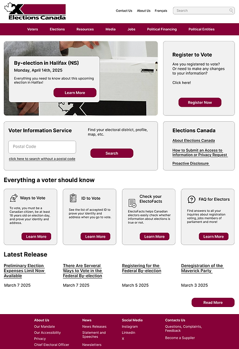
The redesign of Elections Canada’s homepage consists of various changes and improvements.
Noticeable changes are the colour, font size, and layout of the page.
Almost all of the content from the previous design is included in the redesign. The most prominent change being how the information is presented.
Taking into consideration users’ pain points and feedback, it was clear that the current page lacked consistency
and important information on the homepage wasn’t always evident to users.
It was overwhelming to navigate the homepage and most users didn’t find the homepage helpful.
With the new design, users are able to find information on the homepage more efficiently.
Registration Process Redesign
Being able to register to vote online is a very important and useful resource to provide.
After conducting usability testing, and observing how users went through the registration process, it was clear that certain aspects can be improved and some features were missing.
In the redesign, the focus was on still keeping intact all of the information that goes on these pages and representing them in a way that is more digestible.
Multiple key changes were implemented. Firstly, different call-to-action buttons were included. Users now have the option to “Register Now”, “Update Registration” or “Check Registration”. This was specifically designed because a user was unable to directly update their registration information on the current website. Instead, the only option was to complete the entire registration again.
Another pain point brought up by multiple users was the amount of lengthy text and constant scrolling. To combat this pain point, using accordions or drop-down menus to display the information will not only make the information easier for users to digest but also more organised since users can choose to expand the options they are interested in.
Minor changes were made to the registration process to make it more standard and concise. The changes were the inclusion of a progress bar with titles, and certain questions being consolidated under one section.
Although all users found the registration process to be much simpler than they anticipated, they also found they had to consistently press “Next” to answer each question, which felt redundant.

Voter Information Service Page
In this redesign, the focus was on how to display the multiple ways users can search for their electoral district. The search is embedded into one page so users don’t need to be directed to another page after selecting the search option they wish to use.

Voter Information Service
For this page, the main focus was to update the navigation so it can be differentiated from the home navigation. I also rearranged the locations of different information on the page so that it is much easier to read the information about the Electoral District.

ID to Vote
While still including all of the same content, I redesigned how the “Voter Identification” page is visualised by adding drop-down menus and links to access other information.
Users found that in the original format, it was quite daunting to read through the long list of acceptable IDs.


Ways to Vote
Similar to the newly redesigned “ID to Vote” page, I represented the information for the “Ways to Vote” page in a more readable manner. This helps condense the information the user sees right when they enter the page.

Takeaways
My takeaways from completing this project are how important it is to have a good digital presence and how strong digital presences contribute to better user experiences and engagement. I learned how to work with Elections Canada’s content and how best to use the information rather than subtract it to fit my redesign.
I was able to conduct user research and refer to my findings when creating design solutions. The users’ feedback and observations while completing the given tasks highlighted elements and features on the current website that could be improved upon. Taking those findings into consideration, the redesign not only aims to improve the current user experience but also to create more opportunities for users to be engaged with civic information. Through this redesign, users can more efficiently find information and not be overwhelmed with the amount of information. The redesign limits the cognitive overload by using elements such as drop-down menus to condense the information and structure the information into a digestible manner.
This was a great experience as the sole designer to be able to learn and improve my design skills, and to use research to support my design decisions. I would love to work with Elections Canada in the future to take their current website and improve it to be accessible, functional, and well-structured.